Flashback 2011: My Scott Pilgrim and Inception Poster Designs
Some old graphic design work from when I was still in school. Always love playing around in Photoshop and Illustrator, even to this day. Less and less time for it though, but I always take up the chance when I get to.
This project was for a “movie night” at my school to help raise funds for our graduating year art show. I don’t think we were legally allowed to screen these movies for money, but whachagonnado? Anyway, the screening never actually happened. The posters did, however! I had a lot of fun with them. I was just getting into a giallo craze and saw some hilarious parallels with Scott Pilgrim as well as finding some goofy ties between Inception and Scott Pilgrim.
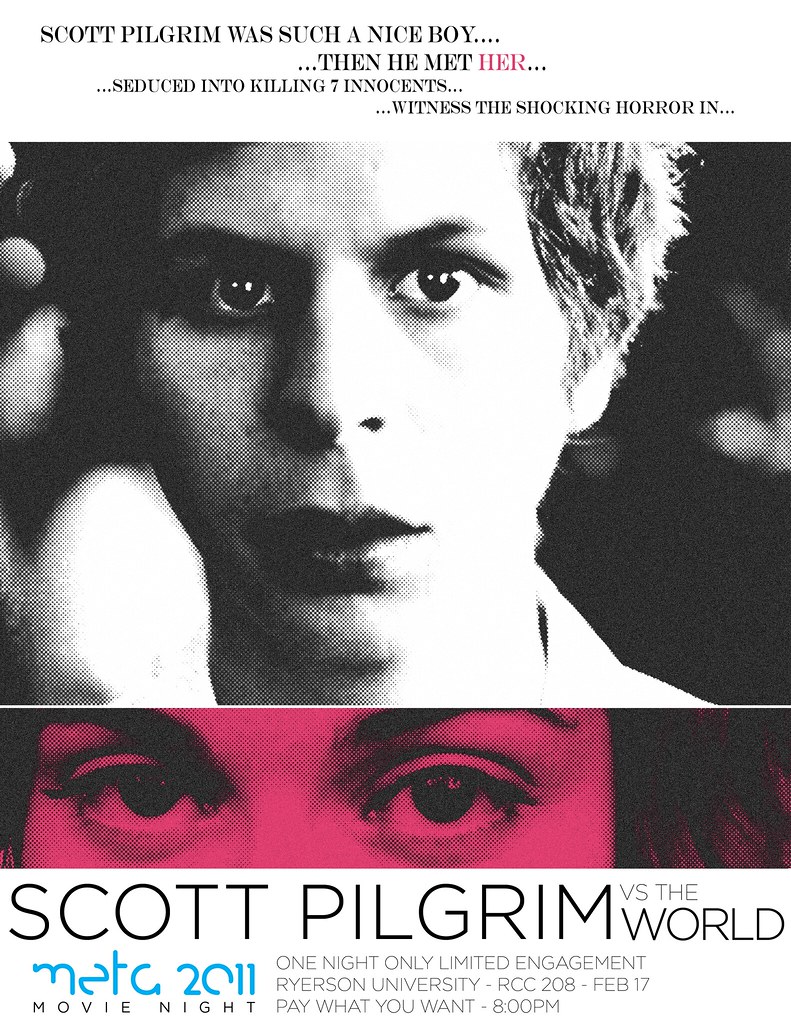
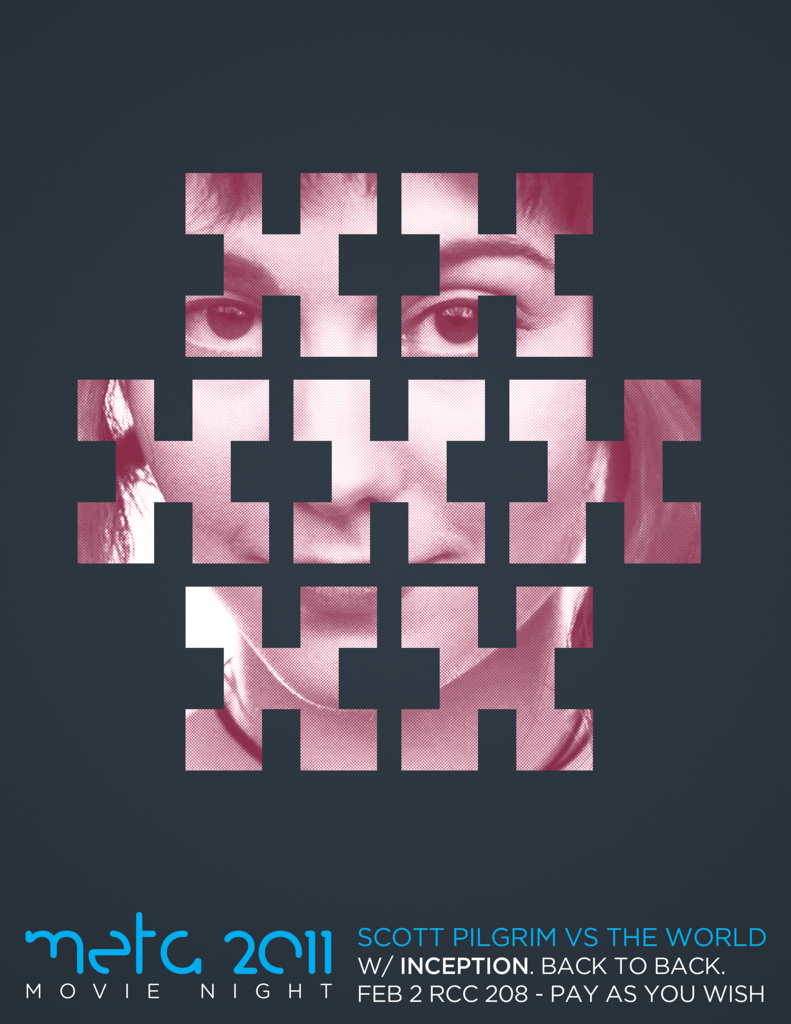
This one got a lot of traction when Edgar Wright (director of Scott Pilgrim and all-around cool dude) saw it on Twitter and shared it on his own site as well as the Scott Pilgrim Facebook page. I got so many requests for prints and purchases I didn’t know what to do with it all. I didn’t know enough about printing (or copyright law) so I just ignored all that. Was a fun 15 seconds though. It’s got 25K views on Flickr!
Love this Giallo style Scott Pilgrim poster by @strausspeter. http://www.flickr.com/photos/pstrauss/5401757341/in/set-72157625857485415/
— edgarwright (@edgarwright) February 5, 2011
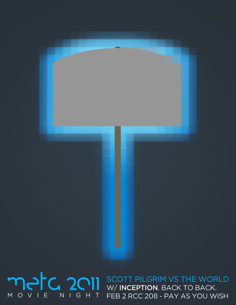
Using an 16-bit sort of style to emulate the look of Ramona’s hammer in Scott Pilgrim. Trying to be all flat and minimalist, as it was the style at the time ya see!
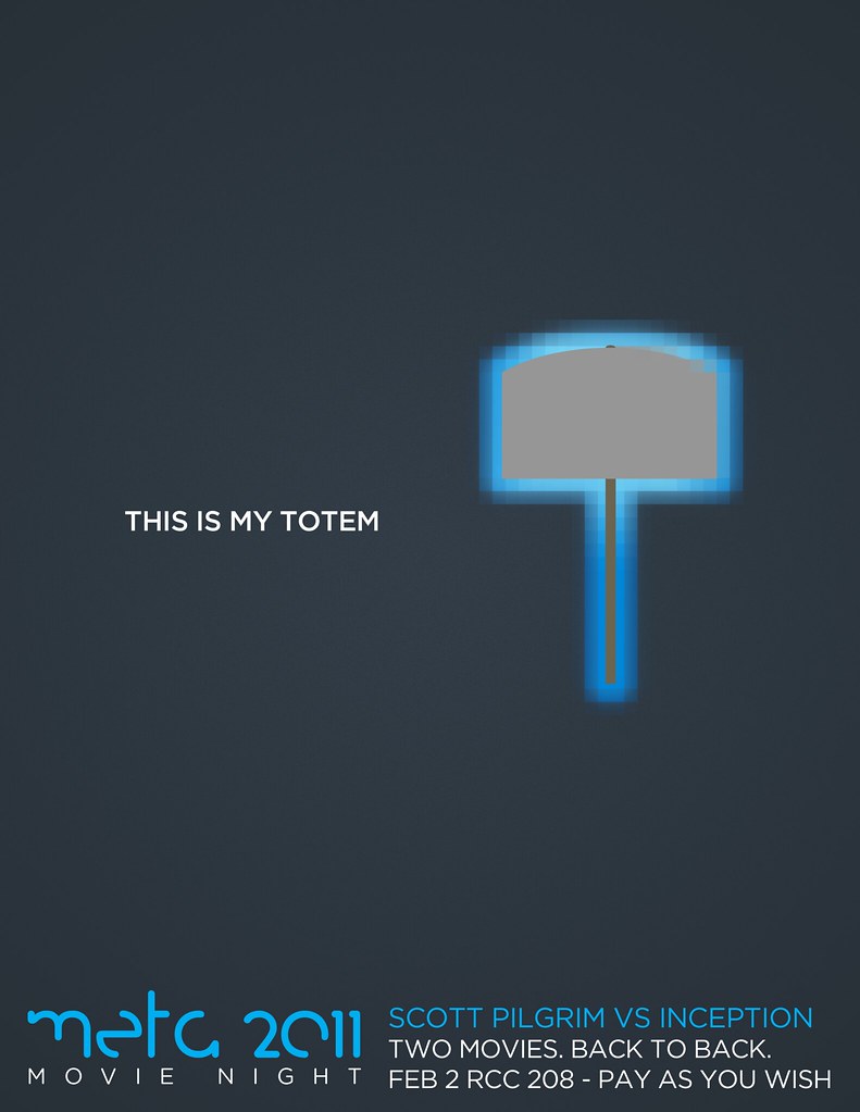
Here is where that whole Inception meets Scott Pilgrim thing came into play. Totems being the things that anchor characters to reality in Inception, the video game stuff being from Scott Pilgrim.
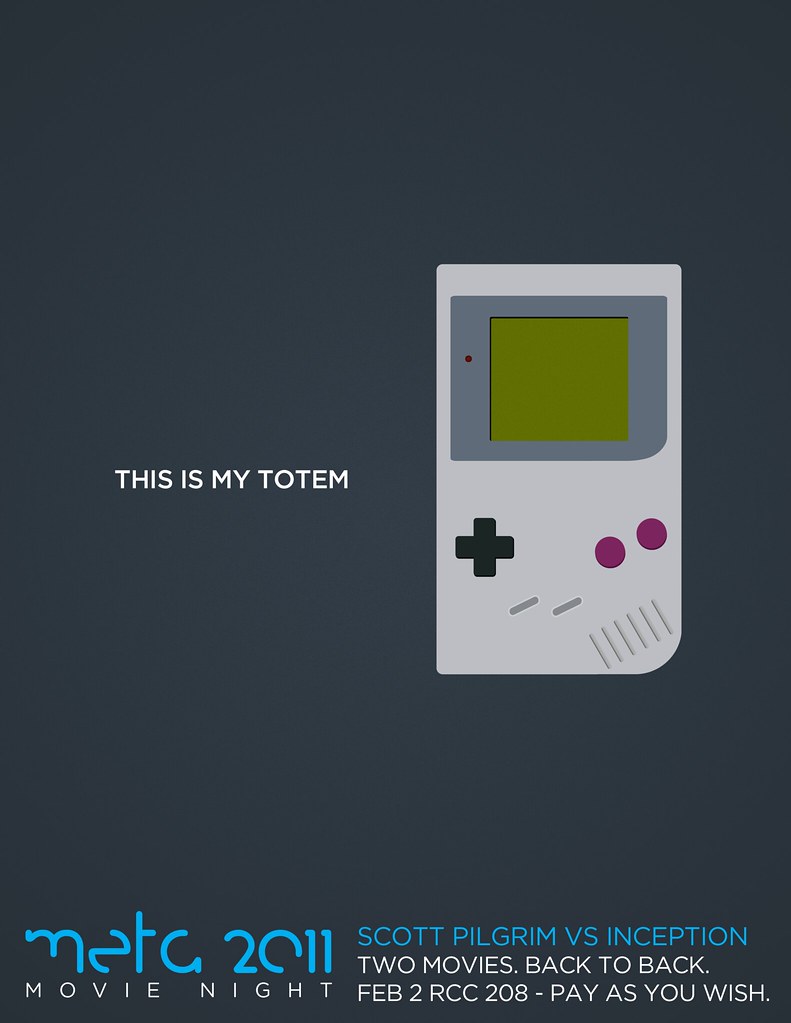
I had a bunch of fun creating this Game Boy. I kind of miss the absolute freedom of designing things in school. If anybody gives you notes, you just tell them to shut up. And by “kind of”, I mean it’s all I dream about anymore.
Forgot about this one! Product of messing around and liking the result.
Got a lot of love for this guy too. Coming off of my Van Gore work I was already doing a lot of this wrinkly, old vintage style work. This one is supposed to look like a thriller from the 50s. I always thought the quotations around the title were so outrageous and hilariously awesome. As well as the “it’s too late” taglines to hook and freak out viewers. If I were to go back, I would bleach bypass a lot of this stuff more and also add some subtle waves and warps to make the paper actually look crinkled.
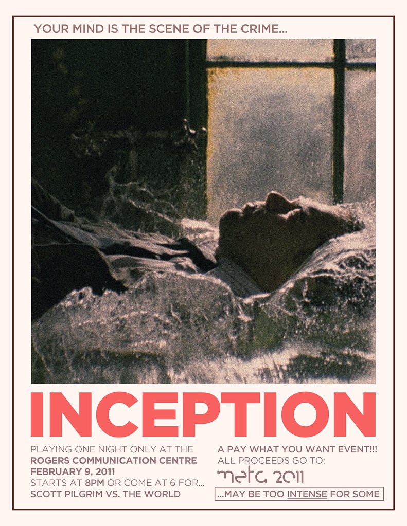
This one is my favourite of the series. It’s more in the vein of 70s thrillers. Elegant as hell, a single freeze-frame with plenty of grain and desaturation. It also tells you nothing about the movie but is a captivating image. It feels very Sam Peckinpah. The bold text. Yeah. I got the “May be too intense for some” from the original Jaws posters which was hanging over my desk at the time. I kept the colour palette small and controlled. Still really dig this guy. I would like to see more modern posters take this reserved approach.
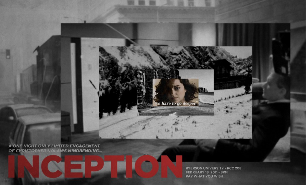
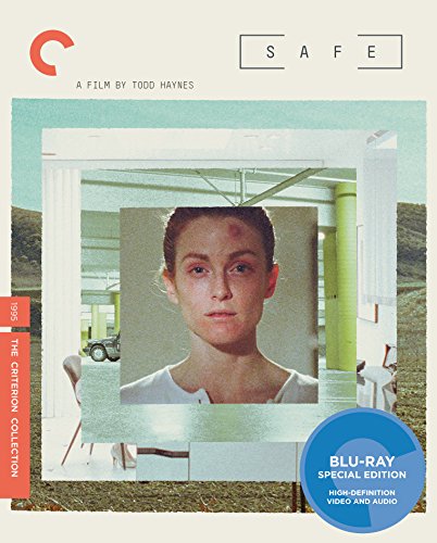
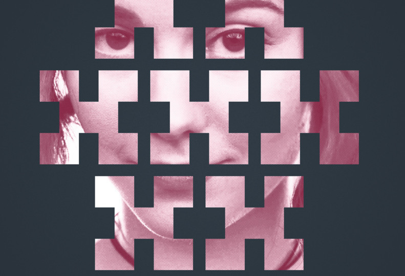
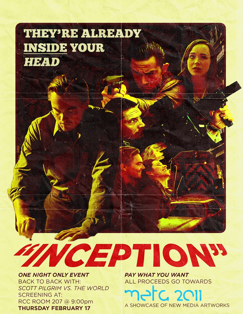
I got more flack from this one than the others because of its unusual dimensions and lack of classic composition. I took still frames from each “level” of the dream world from Inception and boxed them in to Mal in the center, who is the core of the film and Cobb, the protagonist. Some grain, blur and colour effects draw the eye. I guess the text should have been more pronounced. Not sure why I went off center with it. Still, I really like this. And my criticized design decision was vindicated when Criterion released the (amazing) film “Safe” which used the exact same idea in 2014. Point: Peter.